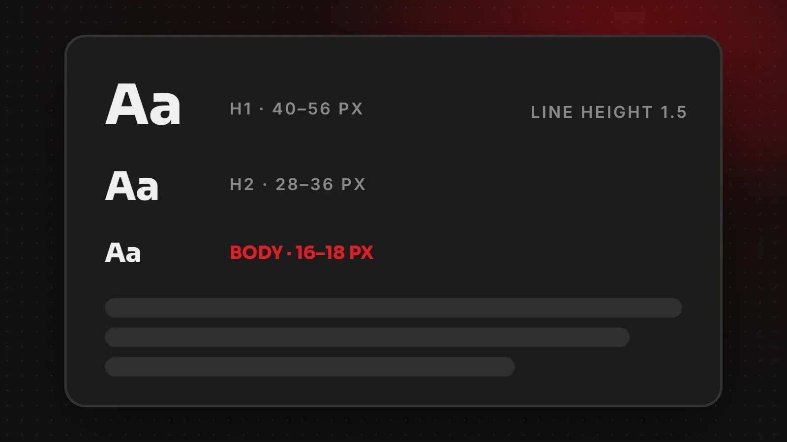
The best font size for websites is 16 to 18 pixels for body text, with a line height of about 1.5 and lines of roughly 50 to 75 characters. Headings should be clearly bigger: around 40 to 56 pixels for the main H1 on desktop and 28 to 36 pixels for H2s. On mobile, keep body text at 16 pixels or more and scale headings down. This guide gives a complete size chart and explains why these numbers work.
- Never go below 16 px for body text; 17 or 18 px often reads better.
- Line height and line length matter as much as font size for readability.
- Form inputs should be at least 16 px so iPhones do not zoom in when people tap them.
Best font size for websites: chart
| Element | Desktop | Mobile |
|---|---|---|
| Body text | 16 to 18 px | 16 to 17 px |
| H1 (page title) | 40 to 56 px | 28 to 36 px |
| H2 | 28 to 36 px | 22 to 28 px |
| H3 | 20 to 24 px | 18 to 22 px |
| Small text (captions, labels) | 13 to 14 px | 13 to 14 px |
| Buttons | 16 to 18 px | 16 px |
| Form inputs | 16 px | 16 px minimum |
Different fonts look different at the same size. For example, a font with a large x-height (tall lowercase letters) reads well at 16 px, while a narrow or light font may need 18 px.
Why 16 px is the minimum for body text
Browsers use 16 px as the default text size because it is comfortable on most screens. Smaller body text forces people to zoom or squint, especially on phones. Google's Lighthouse audit also warns when a page uses text that is too small to read on mobile. As a result, sites with tiny text often feel cheap and hard to use, even if the design looks neat in a mock-up.
Line height and line length
- Line height: around 1.5 times the font size for body text (for example 16 px text with 24 px line height). Headings can be tighter, about 1.1 to 1.3.
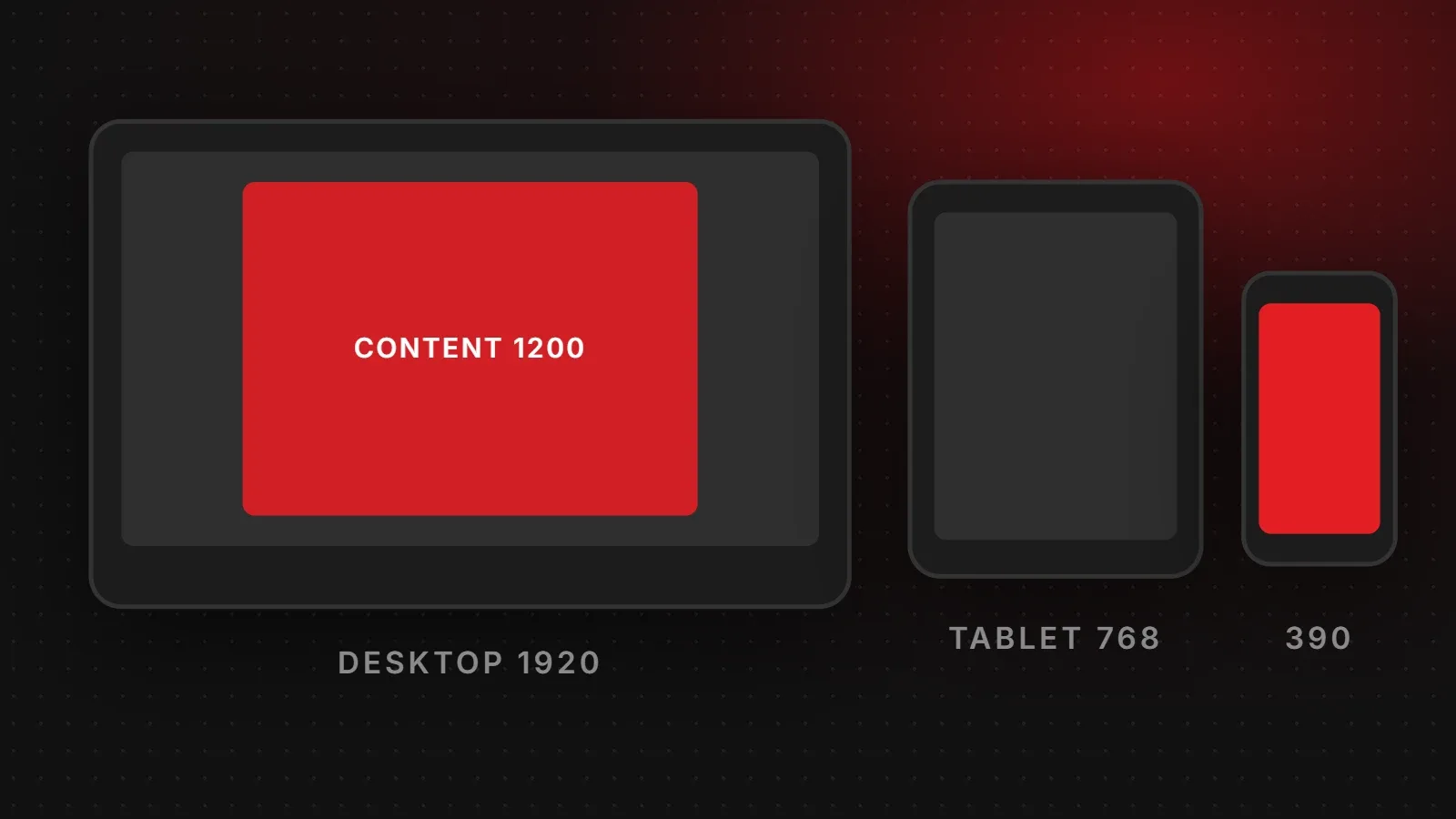
- Line length: 50 to 75 characters per line. Very long lines on wide screens make it hard to find the start of the next line, so limit the content width to about 680 to 760 pixels.
- Paragraph spacing: leave about one line of space between paragraphs.
Font size on mobile
Phones are held closer to the eyes, so body text can stay at 16 to 17 px. However, headings need to shrink: a 56 px H1 that looks great on desktop can take up the whole phone screen. Use responsive sizes in your CSS, for example the clamp() function, so headings scale smoothly between mobile and desktop:
h1 { font-size: clamp(2rem, 5vw, 3.5rem); }
body { font-size: 1.0625rem; line-height: 1.6; }rem units instead of fixed pixels in CSS. If a visitor increases the text size in their browser settings, rem-based text grows with it, which is better for accessibility.Accessibility and readability tips
- Allow zoom. Never disable pinch-to-zoom on mobile. The WCAG resize text guideline expects text to work at 200 percent zoom.
- Use enough contrast. Grey text on a white background must still be dark enough to read easily.
- Limit fonts to two families and a few weights, which also helps website speed.
- Avoid long blocks in capital letters or italics, which are harder to read.
Changing font size in WordPress
Most themes have typography settings under Appearance > Customize or in the theme's global styles. In Elementor, use Site Settings > Typography to set body and heading sizes once for the whole site, with separate values for tablet and mobile.
Frequently asked questions
What is the best font size for websites?
16 to 18 px for body text, with a line height of about 1.5.
Is 14 px too small for body text?
For main body text, yes in most cases. Use 14 px only for small labels and captions.
What font size should headings be?
Around 40 to 56 px for H1 and 28 to 36 px for H2 on desktop, smaller on mobile.
Why does my iPhone zoom in when I tap a form?
The input text is smaller than 16 px. Set form inputs to at least 16 px to stop it.
Want a website that is easy to read on every screen?
Our UI/UX design team sets up type scales, spacing and contrast that make pages comfortable to read, and our responsive web design service makes sure everything works on phones. Get in touch.
Written by the ItsWebExpert team, a web design and development company in Karachi building websites, online stores and apps for businesses across Pakistan.
Ask a Question on WhatsApp