Look around any office, bazaar or bus stop in Pakistan and you will see why mobile matters: people search, compare, message and buy on their phones. For most business websites, the majority of visitors arrive on a phone. Mobile-first design means designing for that small screen first, then expanding for tablets and desktops, rather than squeezing a desktop design onto a phone afterwards.
- Design for phones first: clear text, big buttons, fast pages and one obvious action.
- Make calling and WhatsApp one tap away.
- Test on real, mid-range phones over mobile data, not only on a laptop.
Why mobile-first design matters
- Most visitors are on phones. Check your own Google Analytics to see the split for your site; for most businesses it leans heavily to mobile.
- Google indexes the mobile version. Google mainly uses the mobile version of a page for indexing and ranking, so a poor mobile experience can hold back your SEO.
- Phones mean action. People on phones often want to call, message, get directions or buy right now.
Responsive vs mobile-first design
A responsive site adjusts its layout to fit any screen. Mobile-first design is the approach behind a good responsive site: you decide what matters most on a small screen, design that well, then add more for larger screens. The result is a site that feels made for phones, not one that merely fits on them. Our responsive web design service is built on this approach.
What good mobile-first design looks like
Readable text
Body text should be comfortable to read without zooming, with enough line spacing and strong contrast between text and background.
Thumb-friendly buttons
Buttons and links need to be large enough to tap easily and spaced so people do not tap the wrong one. Put the most important action, such as "Get a Quote" or "Order Now", where a thumb naturally reaches.
One clear action per screen
On a small screen, too many choices cause people to leave. Lead with what you do and the one thing you want the visitor to do next.
Instant contact
Add click-to-call and a WhatsApp button. After all, for many Pakistani businesses, WhatsApp is where enquiries actually happen.
Simple forms
Ask only for what you need, use the right keyboard for each field (number pad for phone numbers), and make error messages clear.
Fast loading
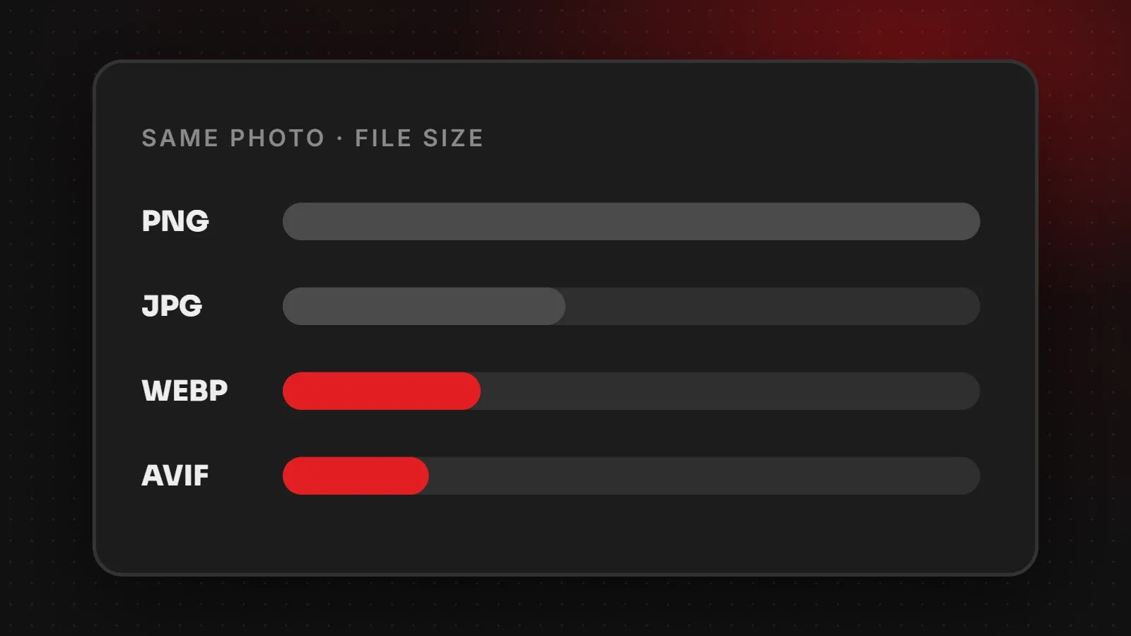
Phones on mobile data feel every extra megabyte. Therefore, optimised images and lean code are part of mobile design, not an afterthought. See our website speed guide.
Easy navigation
A simple menu with your main pages, a visible search for larger sites, and no hidden content that only works on hover.
A quick mobile test you can do today
- Open your website on your own phone, using mobile data rather than Wi-Fi.
- Can you tell within five seconds what the business does?
- Is the text readable without zooming?
- Can you call or message the business in one tap?
- Does the contact form work easily with your thumb?
- Does anything overlap, cut off or force you to scroll sideways?
- If you sell online, can you complete a test order comfortably?
You can also run Google's PageSpeed Insights, which tests the mobile version of your page and points out problems.
Common mobile mistakes
- Pop-ups that cover the whole screen and are hard to close.
- Tiny text and links squeezed together.
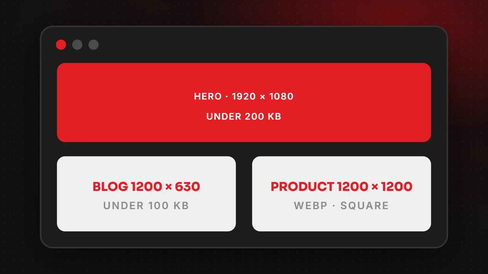
- Large images and videos that make pages slow on mobile data.
- Tables and wide content that force sideways scrolling.
- Phone numbers shown as images, so they cannot be tapped to call.
Mobile-first design is good for everyone
Designing for the smallest screen forces clarity: fewer distractions, clearer messages and faster pages. As a result, desktop visitors benefit too. If your current site struggles on phones, a mobile-first redesign is often the single biggest improvement you can make. Send us your website and we will tell you what to fix first.
Written by the ItsWebExpert team, a web design and development company in Karachi building websites, online stores and apps for businesses across Pakistan.
Ask a Question on WhatsApp