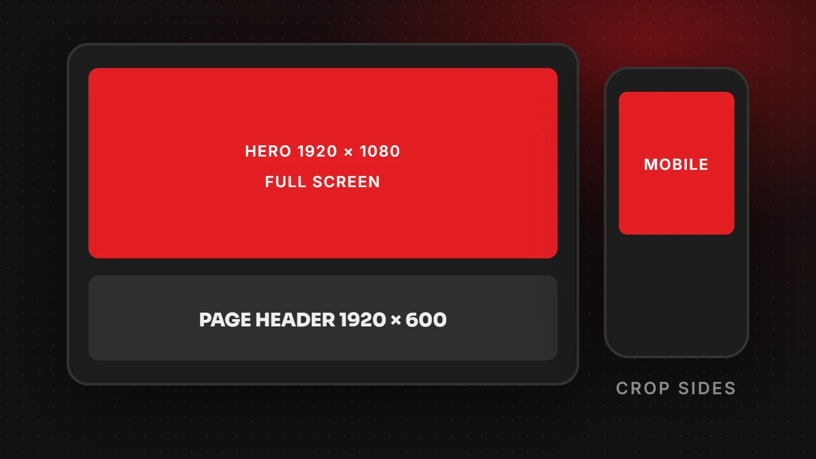
The most common website banner size is 1920 x 1080 pixels for a full-screen hero, and 1920 x 500 to 1920 x 700 pixels for a wide banner or inner page header. Because the same banner is shown on wide desktops and narrow phones, keep text and faces in the centre of the image, and consider a separate mobile banner. This guide gives a size chart and practical tips so banners look sharp and load fast.
- Use 1920 px wide images for full-width banners; the height depends on the layout.
- Put text as real HTML over the image, not inside the picture, so it stays readable on phones.
- Compress banners to under about 200 KB and avoid heavy multi-slide sliders.
Website banner size chart
| Banner type | Recommended size | Ratio |
|---|---|---|
| Full-screen hero | 1920 x 1080 px | 16:9 |
| Large hero (not full screen) | 1920 x 800 px | about 2.4:1 |
| Wide banner / page header | 1920 x 500 to 1920 x 700 px | about 3:1 |
| Slider slide | 1920 x 800 px (same size for every slide) | about 2.4:1 |
| Mobile hero (separate image) | 1080 x 1350 px | 4:5 |
| Promo strip / announcement bar | 1920 x 120 px or text only | Very wide |
Your theme may use different proportions, so check its demo or documentation and match its shape.
How banners crop on different screens
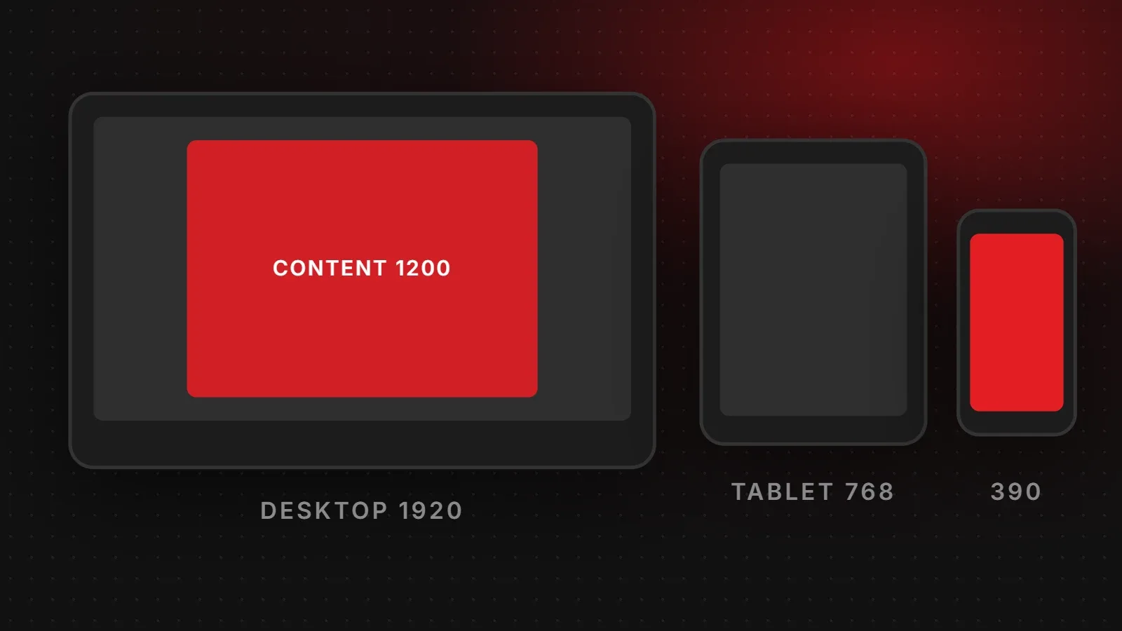
Most themes stretch the banner across the full width and crop it to fit the section height. On a wide desktop, the top and bottom may be cut. On a phone, the sides are cut, because the screen is tall and narrow. As a result, anything at the edges of the image can disappear on mobile. Keep the main subject in the middle third of the image.
Put text on top, not inside the image
Text baked into a banner image becomes tiny and unreadable on phones, cannot be translated, and is invisible to Google. Instead, use a clean background photo and add the headline and button as real text in your page builder. This also lets you change the offer without redesigning the image.
Should you use a separate mobile banner?
If your banner has an important product or person that gets cropped on phones, yes. Most page builders, including Elementor, let you show a different image on mobile. A 4:5 portrait version (1080 x 1350) fills the phone screen nicely.
Keep your banner fast
- Export at 1920 px wide maximum, in WebP, at quality around 80.
- Aim for under 200 KB. See how to compress images without losing quality.
- Do not lazy-load the hero image, because it is usually your LCP element. See how to improve LCP.
- Avoid autoplay background videos above the fold, or use a short, compressed clip with a poster image.
Website banner design tips
- One clear headline and one main button.
- Strong contrast between text and background; add a dark overlay on busy photos.
- Real photos of your product, team or work instead of generic stock images.
- Consistent style with your logo and colours.
For other image sizes on your site, see our website image size guide.
Frequently asked questions
What is the standard website banner size?
1920 x 1080 pixels for a full-screen hero, or 1920 x 500 to 700 pixels for a wide header banner.
Why is my banner cut off on mobile?
The theme crops the sides to fit narrow screens. Keep key content in the centre or use a separate mobile image.
What file size should a banner be?
Under about 200 KB, ideally in WebP format.
Should I put text in the banner image?
No. Add text as real HTML over the image so it stays readable and SEO-friendly.
Want a hero section that converts?
Our UI/UX design team designs hero sections that look great on every screen and load fast, and our creative team produces banners and campaign graphics. Talk to us. You can find free tools to check image formats in web.dev's image course.
Written by the ItsWebExpert team, a web design and development company in Karachi building websites, online stores and apps for businesses across Pakistan.
Ask a Question on WhatsApp