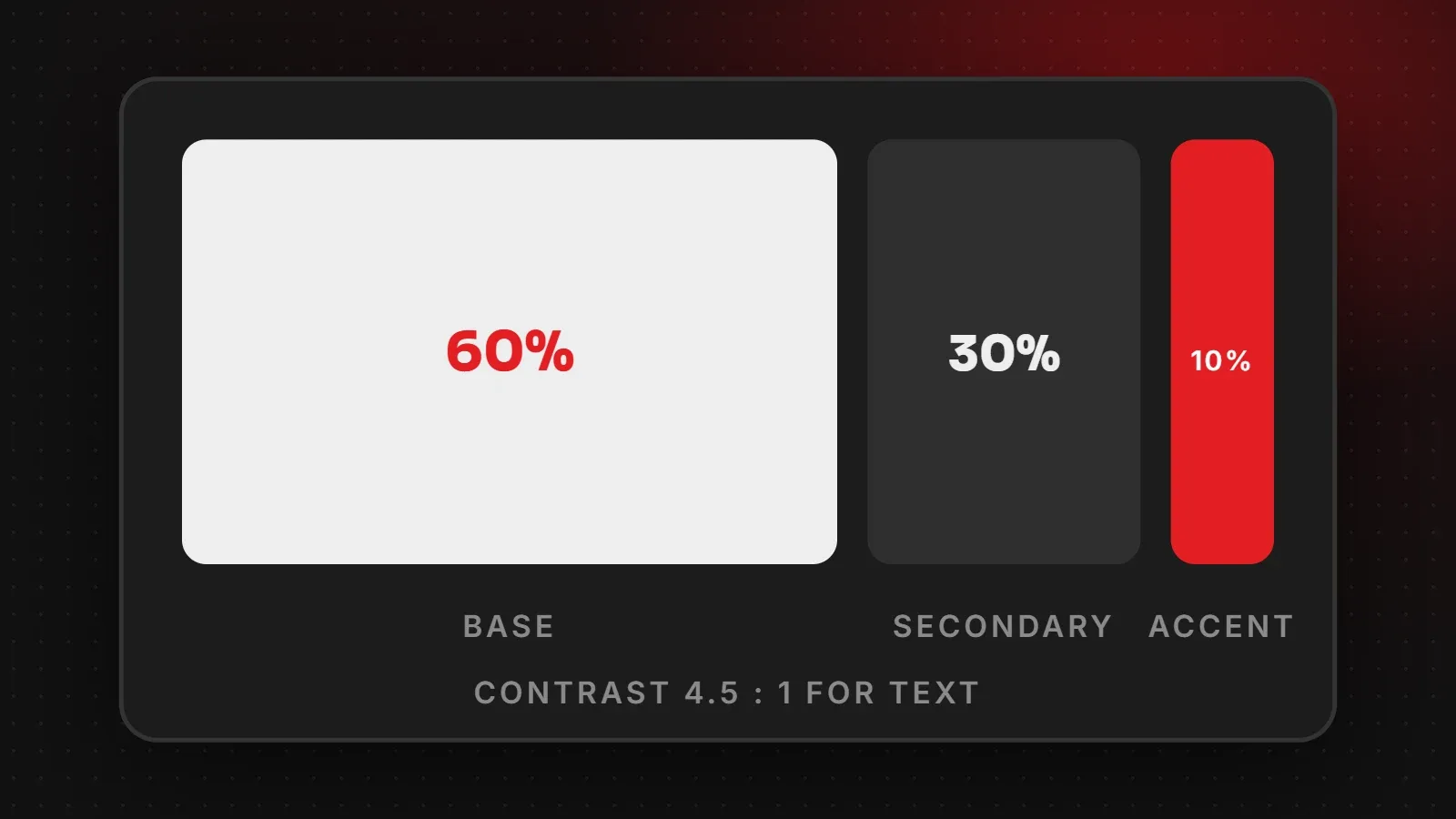
To choose a website color scheme, start with your brand colours from your logo, then build a simple palette: a neutral base for backgrounds (about 60 percent of the design), a secondary colour for sections and headers (about 30 percent), and one strong accent for buttons and links (about 10 percent). Finally, check that text has enough contrast to read easily. This guide explains each step with practical tips.
- Most good websites use two or three main colours plus neutrals.
- Use your accent colour mainly for buttons and links so calls to action stand out.
- Normal text needs a contrast ratio of at least 4.5:1 against its background.
Step 1: Start with your brand colours
Your logo already contains your main brand colour. Use it as the accent or secondary colour, not necessarily as the background of every section. If you do not have brand colours yet, choose one colour that suits your industry and audience, and build around it. See our logo size guide for logo versions on light and dark backgrounds.
Step 2: Use the 60-30-10 rule
| Share | Role | Typical use |
|---|---|---|
| 60% | Base / neutral | Page backgrounds (white, off-white, very light grey or dark) |
| 30% | Secondary | Headers, footers, section backgrounds, cards |
| 10% | Accent | Buttons, links, highlights, icons |
The percentages are a guide, not a law. The idea is to keep one colour dominant, one supporting, and one used sparingly so it attracts attention.
Step 3: Check contrast for readability
Low-contrast text, such as light grey on white, is hard to read, especially on phones outdoors. The WCAG contrast guideline recommends at least 4.5:1 for normal text and 3:1 for large text. Free contrast checkers let you paste two colours and see the ratio instantly.
Step 4: Choose a clear button colour
- Use the same accent colour for all main buttons across the site.
- Make sure the button colour does not appear in many decorative places, or it stops standing out.
- Check the button text contrast too, for example white text on a dark red or blue button.
Colour and industry: common associations
| Colour | Often associated with |
|---|---|
| Blue | Trust, technology, finance, healthcare |
| Green | Nature, health, growth, food |
| Red | Energy, urgency, food, bold brands |
| Orange and yellow | Friendly, affordable, creative |
| Black and gold | Luxury, premium fashion |
These are tendencies, not rules. Standing out from competitors can matter more than following the usual colour for your industry.
Common colour mistakes
- Too many bright colours competing for attention.
- Light grey text that fails contrast checks.
- Different button colours on different pages.
- Colour as the only signal, for example red text for errors without an icon or message.
Frequently asked questions
How many colours should a website have?
Usually two or three main colours, plus neutrals such as white, grey and black.
What is the 60-30-10 rule?
A guideline to use one main colour for about 60 percent of the design, a secondary colour for 30 percent and an accent for 10 percent.
What is a good contrast ratio for website text?
At least 4.5:1 for normal text and 3:1 for large text, according to WCAG.
Should my website use my logo colours?
Yes, as a starting point, but balance them with neutrals so pages stay easy to read.
Want a professional colour palette?
Our branding team builds colour palettes and brand guidelines, and our UI/UX design team applies them consistently across your website. Also read our font size guide. Contact us.
Written by the ItsWebExpert team, a web design and development company in Karachi building websites, online stores and apps for businesses across Pakistan.
Ask a Question on WhatsApp