There is no single best image size for every website, but there is a best size for each type of image. As a rule of thumb, the best image size for websites is 1920 pixels wide for full-width hero images, 1200 pixels wide for blog and content images, and 1200 x 1200 pixels for product photos. Then compress them so most images are under 100 KB and hero images stay under about 200 KB. This guide gives you a size chart, explains why file size matters as much as pixel size, and shows how to prepare images properly.
- Size images for how wide they appear on screen, not bigger.
- Pixel size controls sharpness; file size (KB) controls speed. You need to get both right.
- Use WebP for most website images and always compress before uploading.
Image size for websites: the chart
| Image type | Recommended size | Target file size |
|---|---|---|
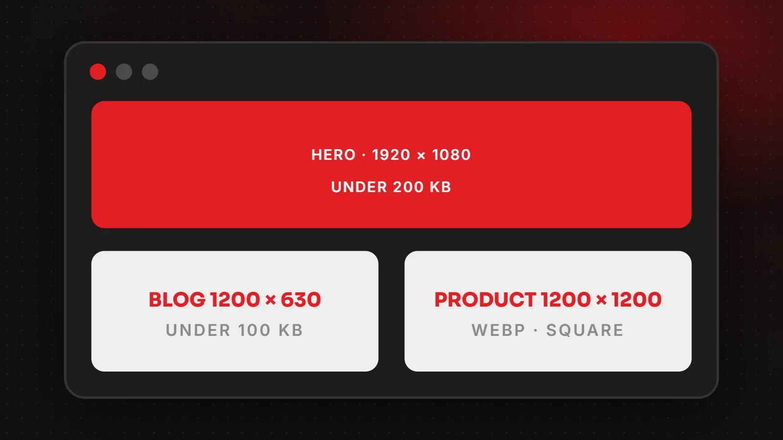
| Full-width hero or slider image | 1920 x 1080 px (16:9) | Under 200 KB |
| Half-width banner or section image | 1000 x 750 px | Under 120 KB |
| Blog featured image | 1200 x 630 px | Under 100 KB |
| Images inside a blog post | 1200 px wide (any height) | Under 100 KB |
| Product photo (e-commerce) | 1200 x 1200 px (1:1) | Under 150 KB |
| Product thumbnail | 400 x 400 px | Under 30 KB |
| Team or profile photo | 600 x 600 px | Under 50 KB |
| Logo in header | SVG, or PNG at 2x its display size | Under 20 KB |
| Background pattern or texture | As small as possible, repeated | Under 50 KB |
The blog featured image size of 1200 x 630 also matches what Facebook, WhatsApp and LinkedIn use for link previews, so one image does both jobs.
Pixel size vs file size: what is the difference?
Pixel size (for example 1920 x 1080) is the width and height of the image. It decides how sharp the image looks. File size (for example 180 KB) is how much data the visitor has to download. It decides how fast the page loads.
A photo straight from a modern phone can be 4000 pixels wide and 4 MB in size. A website usually shows it at about 1200 pixels wide, so most of that data goes to waste. Visitors on mobile data pay for it with a slow page. Resizing that photo to 1200 pixels and compressing it can bring it down to around 100 KB with no visible loss of quality.
Do you need double-size images for retina screens?
High-resolution phone and laptop screens show more pixels in the same space, so very small images can look soft. You do not need to double everything, though:
- Hero images: 1920 pixels wide is enough for almost every screen. Going to 2560 adds weight for little visible gain.
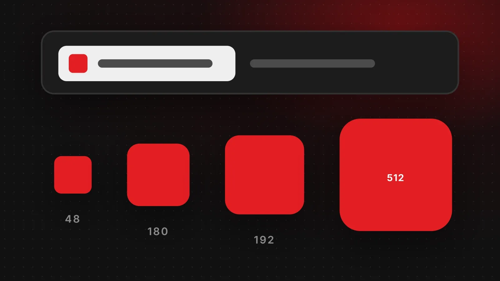
- Logos and icons: use SVG where possible. It stays sharp at any size and is very small.
- Small images: if an image appears at 300 pixels wide, export it at 600 pixels wide for crisp results.
Modern WordPress themes and most website builders automatically create several sizes of each image and let the browser pick the right one. This is called responsive images, and it is one more reason to upload a sensible image size for websites rather than a huge original.
Which image format should you use?
| Format | Best for |
|---|---|
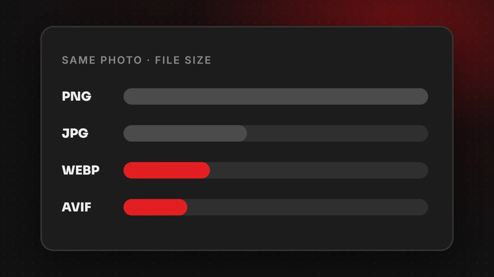
| WebP | Most photos and graphics. Smaller than JPG and PNG at the same quality. |
| AVIF | Even smaller than WebP. Good where your platform supports it. |
| JPG | Photos, when WebP is not available. |
| PNG | Graphics that need a transparent background, screenshots with text. |
| SVG | Logos, icons and simple illustrations. |
How to prepare the right image size for websites
- Crop to the right shape first (16:9 for heroes, 1:1 for products).
- Resize to the width in the chart above.
- Compress using a free tool such as Squoosh or TinyPNG, or an image optimisation plugin on WordPress.
- Rename the file with clear words, for example
leather-jacket-brown.webpinstead ofIMG_4021.jpg. This helps image search. - Add alt text that describes the image for screen readers and search engines.
- Set width and height in the HTML (most CMSs do this for you) so the page layout does not jump while images load.
Common image mistakes that slow websites down
- Uploading phone photos at full size (3 to 6 MB each).
- Using PNG for photographs, which makes them several times larger than needed.
- Large sliders with five or six full-size images that all load at once.
- Images stretched in the browser, which look blurry and waste data.
- No lazy loading, so images far down the page load before the visitor scrolls.
Images are usually the biggest cause of a slow page. Our website speed guide covers the other common causes and how to fix them.
Frequently asked questions
What is the best image size for a website banner?
1920 x 1080 pixels for a full-width banner, compressed to under about 200 KB.
What size should blog images be?
1200 x 630 pixels for the featured image and 1200 pixels wide for images inside the post.
What is a good file size for website images?
Aim for under 100 KB for most images and under 200 KB for large hero images.
Should I use JPG or WebP?
WebP in most cases. It gives the same quality at a smaller file size and all modern browsers support it.
What size should product images be?
1200 x 1200 pixels, square, on a clean and consistent background.
Want a website that looks sharp and loads fast?
Choosing the right images is a big part of good web design. Our responsive web design team prepares every image for desktop and mobile, and our speed and performance service can optimise the images on your existing site. Get in touch for a free review.
Written by the ItsWebExpert team, a web design and development company in Karachi building websites, online stores and apps for businesses across Pakistan.
Ask a Question on WhatsApp