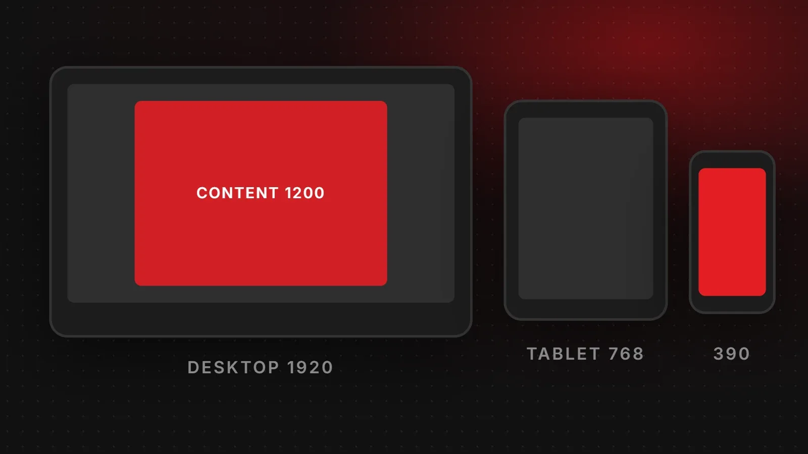
There is no single website width any more. Instead, design for a range: phones are mostly about 360 to 430 CSS pixels wide, tablets around 768 to 1024, and desktops commonly 1366 to 1920. Most sites limit the main content to a container of about 1140 to 1320 pixels on large screens, so lines stay readable. This guide explains common screen resolutions, CSS pixels and the breakpoints worth testing.
- Design mobile first, starting around 360 to 390 px wide.
- Limit content width to about 1140 to 1320 px on desktop; let backgrounds go full width.
- Test at a handful of breakpoints rather than every device.
Common screen resolutions
| Device type | Common widths (CSS pixels) |
|---|---|
| Small phones | 360 px |
| Modern phones | 390 to 430 px |
| Tablets (portrait) | 768 to 834 px |
| Tablets (landscape) and small laptops | 1024 to 1280 px |
| Laptops | 1366 to 1536 px |
| Desktop monitors | 1920 px and above |
Exact shares change every year and vary by country. You can see current data on StatCounter, or better, check your own site's visitors in Google Analytics under Tech details.
CSS pixels vs device pixels
A phone advertised as "1170 x 2532" does not show your site 1170 pixels wide. Phones have high-density screens that use several physical pixels for each CSS pixel. That phone behaves like a 390 px wide screen in the browser. Therefore design and test using CSS widths, and export images at 2x so they stay sharp.
What website width should your content be?
- Main container: about 1140 to 1320 px on desktop, centred.
- Text columns: about 680 to 760 px wide for comfortable reading (50 to 75 characters per line). See our font size guide.
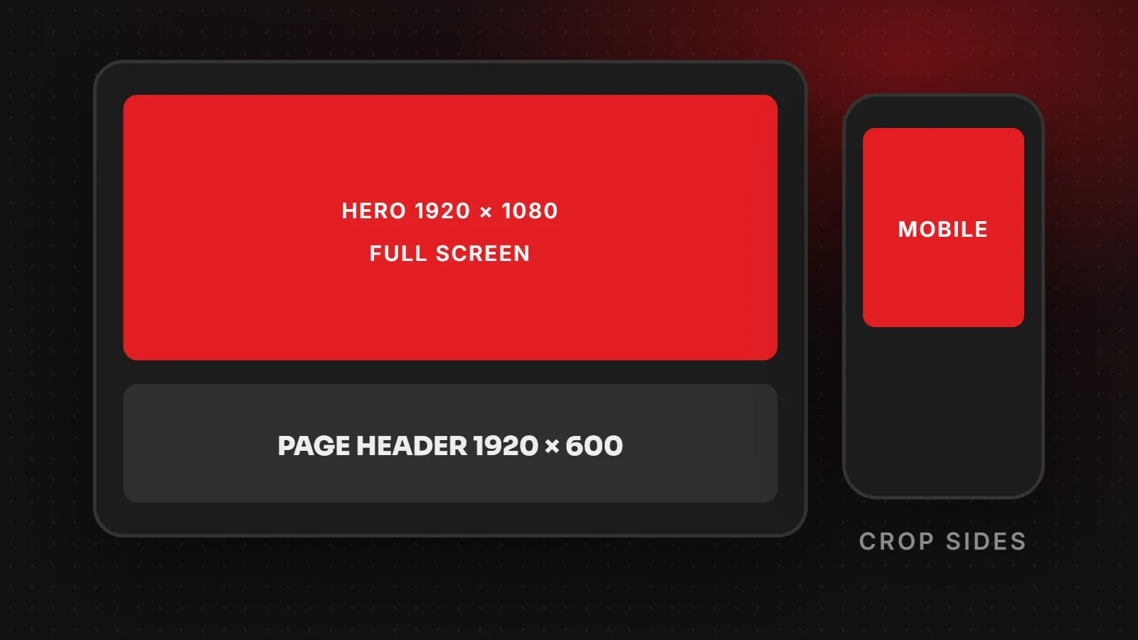
- Full-width sections: backgrounds and hero images can stretch edge to edge while the text stays in the container.
- Side padding on mobile: 16 to 24 px so text does not touch the screen edge.
Breakpoints most websites use
| Breakpoint | Layout change |
|---|---|
| Up to 767 px | Single column, mobile menu |
| 768 px | Two columns, larger spacing |
| 1024 px | Full desktop menu, three or four columns |
| 1280 px and up | Content container reaches its maximum width |
How to test your website width
- In Chrome, press F12 and click the device toolbar icon to preview common phone and tablet sizes.
- Drag the window from narrow to wide and watch for broken layouts, overflowing images or squashed text.
- Check on at least one real Android phone and one iPhone.
- Make sure nothing causes sideways scrolling on mobile.
Frequently asked questions
What is the standard website width?
Most sites use a content container of about 1140 to 1320 px on desktop, with full-width backgrounds.
What screen resolution should I design for?
Start with mobile at 360 to 390 px wide, then scale up to tablet (768 px) and desktop (1366 to 1920 px).
Is 1920 px the website width?
1920 is a common desktop screen width, but content is usually narrower and centred. Backgrounds can fill 1920 px.
Why does my site scroll sideways on mobile?
An element, often an image, table or fixed-width section, is wider than the screen. Set it to a maximum width of 100 percent.
Want a site that fits every screen?
Our responsive web design team builds and tests layouts on real phones, tablets and desktops. Read our article on mobile-first design or contact us.
Written by the ItsWebExpert team, a web design and development company in Karachi building websites, online stores and apps for businesses across Pakistan.
Ask a Question on WhatsApp