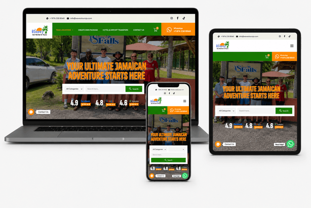
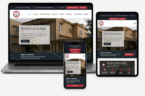
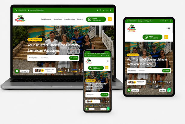
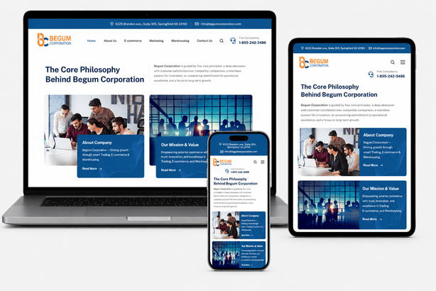
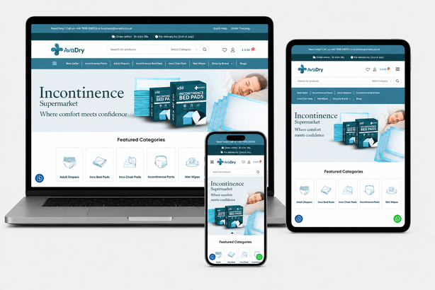
Isn't every website responsive by default now?
Not really — many older sites or cheap templates just shrink the desktop layout, which often breaks navigation and readability on real phones.
Can you fix responsiveness on my existing site without a full rebuild?
Often yes — depending on how the site was built, we can target specific mobile issues without starting over.
Do you test on real phones or just browser tools?
Both — browser tools catch obvious issues fast, but we always confirm on real devices before launch.
Will my site look different on mobile vs desktop?
Yes, intentionally — layouts adapt to make the most of each screen size rather than just shrinking everything uniformly.
Does responsive design affect my SEO?
Yes — Google uses mobile-first indexing, so a poor mobile experience directly hurts your search rankings.
How do you handle tables or complex layouts on small screens?
We redesign complex layouts specifically for mobile — often as stacked cards, scrollable tables, or simplified views — rather than forcing a desktop layout to shrink.
How do I know if my website is mobile-friendly?
Open it on your phone and try to read a page, open the menu and fill in a form. If anything is hard, it isn't truly responsive. We also offer a free check using Google's PageSpeed Insights and real-device testing.
Is responsive design the same as having a mobile app?
No. A responsive website works in any mobile browser without installing anything. An app is installed from an app store. Most businesses need a responsive website first, and an app only if customers use it often.
How long does it take to make an existing site responsive?
For a small site, often one to two weeks. Larger or older sites may be faster to rebuild than to patch, and we will tell you honestly which option makes more sense.